Log In
Free consultation with ASO specialists
Doing ASO for the first time or have no idea how to carry out targeted optimization of your app?
We offer one-on-one customized services provided by app marketing specialists
Competitor Analysis and Conversion Funnel Double Drive: Build an App Store Page with Ultra-High Conversion Rate
2025-09-08
In ASO optimization, many developers will fall into a dilemma: although they copy the "hit technique" of the industry - for example, stacking high-heat keywords in the title and imitating the screenshot style of popular apps, the final effect is completely different: others' natural downloads doubled, but their page conversion rate always lingered at30% or less. The root of the problem is not "ineffective techniques", but the lack of a "scientific anchor" for optimization - neither understanding what users really care about, nor knowing which detail hides the "high conversion" of competitors.
To break this "blind trial and error" cycle, we need a complete methodology from analysis to implementation: using competitor analysis as "scouts" to find effective directions verified by the market; using conversion funnels as "battle maps" to precisely match optimization actions with every step of user decision-making; and then using data verification to ensure that each adjustment can improve conversion. This article will guide you through landing this methodology step by step, turning your app store page from a "passive display" into a core position for "actively acquiring new users".
Cornerstone before optimization: Use competitor analysis to lock "high conversion password"
When many people do competitor analysis, they only simply copy competitors' keywords or screenshots, but ignore the "logic behind" - why does the competitor choose this keyword? Why does the screenshot highlight this selling point? These details are the key to determining conversion. The conversion funnel model (exposure → click → download → activation → retention) is the best tool for breaking down competitors' "high-conversion passwords". It can help you turn vague "feelings" into actionable "optimization points".
Step 1: Select the right competitors to avoid analyzing in the wrong direction
Not all "similar apps" are worth analyzing. Choosing the wrong competitors will make subsequent optimization completely deviate from the target. Correct competitor screening needs to cover two types:
-
Direct competitors: highly consistent in functions, target users and business models, and ranking higher than your app in the app store and with more downloads. For example, if your accounting app is targeted at "young people for simple accounting", you should not analyze professional financial software for enterprises, but focus on the leading accounting apps with the same positioning.
-
Indirect competitors: They solve the same user pain points but in different forms, and can provide "differentiated inspiration". For example, your "fat loss recipe app" can analyze the screenshot storylines of "fitness check-in apps" - how they use "before-and-after comparison pictures of users" to stimulate downloads. This visual logic can be completely reused.
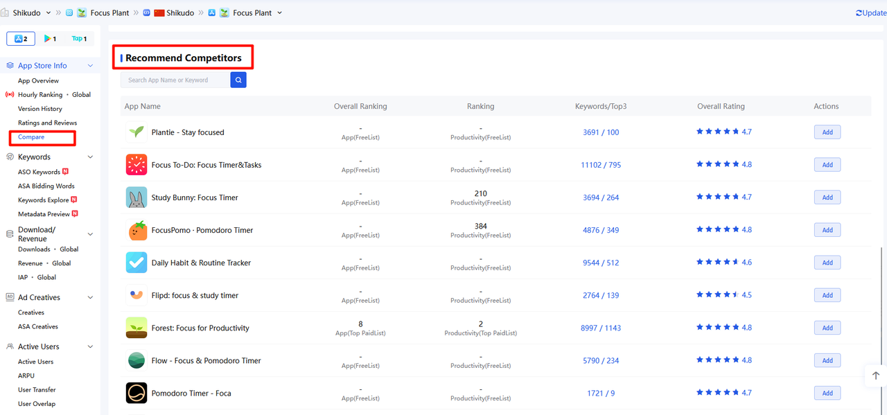
Filter tool recommendation: Use the "Competitor Comparison" function of ASO tools (such as UPUP) to automatically recommend apps highly related to your product, helping you quickly lock 3-5 core analysis objects.
Step 2: Use the conversion funnel to break down the "high conversion details" of competitors
Taking "exposure → click → download" as the framework of three core links (this is the part that the store page can directly affect), we will explore the optimization logic of competitors in each link, and answer the question "What did competitors do? Why did users buy it? What can I learn?" for each link.
Exposure layer: What keywords do competitors rely on to be "found by users"?
Core objective: Understand the keyword layout strategy of competitors and fill your own "traffic gap".
-
Analysis Dimension:
-
Core keywords: Which words are prioritized in the title and subtitle (iOS) / short description (Google Play) of competing products?
-
Long tail word coverage: Which "low competition but high precision" words are buried in the long description of competitors?
-
-
Action: Sort the keywords of competitors according to "search volume + relevance + competition", extract the "high-value words" that you have not covered (for example, the words ranked in the top 5 of competitors and not ranked in the top 20 of yourself), and add them to your metadata.
Click layer: Why can the "first sight information" of competitors attract clicks?
Users stay in the search results list for a short time, and only three elements ("icon + title + ratings") can influence click decisions. The advantages of competitors are often hidden in details.
-
Analysis Dimension:
-
Icon: Does the icon of the competing product have a "visual memory point"? For example, most accounting apps use blue icons, but one competing product uses an "orange + cartoon wallet" icon, which stands out instantly in the list; then see if the icon conveys the core function?
-
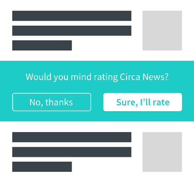
Ratings and number of reviews: What are the ratings (whether ≥ 4.5 stars) and number of reviews (whether more than 100 new reviews per month) of competitors? If the competitor has a high rating, you can download it yourself to see its "review guidance timing".
-
-
Landing action: If the click rate of your icon is low (you can view it through "Product Page Analysis" in App Store Connect), imitate the logic of visual differentiation of competitors (for example, adjust colors and simplify patterns); if your Ratings are lower than those of competitors, refer to the timing of positive reviews pop-up of competitors and optimize the in-app prompt process.
Download layer: How does the page of competitors "persuade users to download"? (Core analysis)
This is the key to conversion. The "screenshot/video + description + review management" of competitors together constitute a "persuasion system", which needs to be broken down element by element:
-
Screenshot/Video: Does the competitor tell a user story instead of listing features?
-
For example, the order of screenshots for a fat-loss recipe app: the first picture is "User's 30-day fat-loss comparison chart (pain point + result) → The second picture is "automatically recommended recipes based on input weight" (solution) → The third picture is "one-click shopping list generation" (core function) → The fourth picture is "4.9-star positive review screenshot" (social proof). This logic of "pain point → solution → trust" has a higher conversion rate than simply showing screenshots of "recipe lists".
-
Also look at the screenshots and copy of competitors: whether to use "user benefits" instead of "feature description"? For example, competitors write "get a week's recipe in 3 minutes", not "support week recipe generation" - the former directly tells users "can save time", while the latter just says the function, and the persuasiveness is completely different.
-
-
Description: Do the first 3 lines of the competitor "hit the sore spot"?
-
Most users will not finish reading a long description. The first three lines decide whether to continue reading. Directly pointing out the pain point of "Moonlight" and then giving a solution can attract more users than "a professional accounting tool that supports multi-account synchronization".
-
-
Review Management: How do competitors use reviews to "build trust"?
-
See if the competitors reply to all negative reviews, and whether their replies "solve problems" rather than being perfunctory. For example, a user says "Bill synchronization failed", and the competitor replies: "Hello! Synchronization problems can be solved through [My - Settings - Reset Synchronization]. If there are still problems, please contact customer service XX, and we will respond within 1 hour." This kind of reply can not only win back this user, but also make potential users feel that "the developer is reliable".
-
Many developers tend to miss the long-tail keywords with "low competition and high conversion" or even misjudge the keyword relevance due to lack of ASO experience when extracting high-value keywords from competitors and sorting out metadata gaps. At this time, you may as well seek professional support: consult nowappfast customer service, you can get a free 1-on-1 App keyword library customization service. We will combine your product positioning, target users and competitor keyword layout to screen out the core words and long-tail keywords with "high search volume + high relevance + medium-low competition", helping you quickly fill the traffic gap and avoid detours in keyword layout.
Breaking Through Layer by Layer: Conversion Optimization Practice Based on Competitor Analysis
After finding the "optimization direction" through competitive analysis, it is necessary to combine the conversion funnel of the "exposure → click → download" link and turn "inspiration" into specific actions. The optimization of each link must be closely linked to the "user decision logic" to avoid meaningless adjustments.
Exposure → Click: Increase the click-through rate (CTR), and let more users enter the page
Core objective: to make users "choose you first" in search results, and key optimization is "keyword accuracy + first impression information attraction".
Keywords: From "Gaining Popularity" to "Precise Matching"
-
Keyword Optimization Based on Competitor Analysis:
-
Title/Subtitle: Put the keywords with high competition ranking and strong relevance to yourself first. For example, if you find that the competitor "Minimalist Accounting" ranks in the top 3 and has a high search volume, put it in the title and add differentiated selling points.
-
Long-tail keyword layout: Naturally incorporate "high-precision long-tail keywords" that cover competitors in the long description. For example, if competitors use "student party accounting," you can write "a student party designed accounting app, no ads to help you manage your living expenses every month"—both containing keywords and conveying value.
-
-
Avoidance points: Do not pile up irrelevant words (such as adding "financial management" and "loan" to the accounting app).
Icon + Title + Ratings: Build a "High Click Combination"
-
Icon: "Visual differentiation" from competitors, but retain brand recognition.
-
Title: On the basis of including core words, add "user interest points".
-
Ratings: Actively guide positive ratings, and refer to the "guidance timing" of competing products.
Click → Download: Increase the Conversion Rate (CVR), so that users who enter the page want to leave
This is the top priority of optimization. The page's "visual materials + copywriting + reviews" jointly determine the conversion, and the core is to "let users believe that 'download can solve his problem'".
Visuals: Design screenshots/videos by "user story line"
-
Screenshot logic: Refer to the structure of "pain points → solution → trust" of competitors, and combine with its own differentiated selling points. Take the "fat loss recipe app" as an example:
-
First picture: pain point scenario + core result, use a comparison chart to enhance the impact;
-
Fig. 2-3: Core functions (such as "Recommend recipes automatically based on input weight" and "Generate shopping list with one click"), each figure is accompanied by a short copy;
-
Last 1 image: Social proof (e.g. "4.9 ratings, 1 million users using") or call to action.
-
-
Preview video: Grab attention in the first 3 seconds, refer to the logic of "dynamic display" of competitors. For example, the opening of a fitness app video: "Teach you how to slim your waist in 30 seconds, and you can practice at home" - directly show the advantages of "short time + easy operation", which is more interesting than "we have more than 1000 fitness videos".
Description: The first 3 lines hit the pain points, the middle part lists the benefits, and the end promotes action
-
The first 3 lines: Imitate the writing style of "Pain points + Solutions" of competitors.
-
Middle part: Divide the points into "Core Features + User Benefits", and use the ✅ symbol to improve readability. For example:
-
✅ Automatic synchronization of bills: no need to enter manually, real-time synchronization of bank card consumption;
-
✅ Set a savings goal: set a "buy a phone" goal, and the system will help you plan how much to save each month;
-
-
Conclusion: Add a call to action, and refer to the "benefit stimulation" of competitors.
Reviews: Turn the comment section into a "trust endorsement field"
-
Negative ratings handling: reply according to the "problem solving" logic of competitors. For example, if users say "crash", reply: "Hello! The crash problem can be solved by [Me - About - Clear Cache]. If you still have problems, please contact customer service XX (response within 1 hour on weekdays from 10 am to 10 pm). We are very sorry for any inconvenience caused!"
-
Positive ratings utilization: Add the "keywords" from positive high-frequency ratings into descriptions or screenshots. For example, many users say "no ads and very clean", so put "no ads" in the subtitle, or mark "100% no ads" on the screenshot.
After you have optimized the screenshots, descriptions and reviews according to the above methods, you may still be unsure whether the existing metadata fully matches user search habits or whether the screenshot copywriting really hits the pain points. Don't let "uncertainty" delay conversion improvement: You can now apply for the appfast metadata diagnosis plan, which will help you identify metadata vulnerabilities from three dimensions: keyword coverage completeness, copywriting attractiveness, and competitive differentiation. At the same time, we will provide actionable adjustment suggestions based on high-conversion industry cases, ensuring that each optimization precisely targets the user decision point.
Continuous Optimization: Use A/B Testing to Verify the Effect, Avoid "Pseudo-optimization"
The "inspiration" obtained from competitor analysis cannot be directly launched in full scale - for example, you may think the "orange icon" of competitors is good, but it may not be suitable for your users; the "screenshot storyline" you imitate may have a lower conversion rate than the original. A/B testing is the only tool that can verify whether the optimization is effective, and it can help you eliminate subjective judgment and find the optimal solution with data.
Define test goals and variables
-
Test objective: Each test focuses on only one core indicator, such as "test the impact of new icons on click rates" and "test the impact of new screenshots on conversion rates", avoiding changing multiple elements at the same time (for example, changing icons and screenshots at the same time, it is impossible to determine which element works);
-
Test variables: Select "Key differentiators found in competitive analysis". For example:
-
Icon test: Version A (original blue icon) vs. Version B (orange icon imitating competitors);
-
Screenshot test: Version A (list of features) vs. Version B ("pain point → result" storyline in the style of competitors);
-
Description test: Version A (feature first) vs. Version B (pain point first).
-
Follow the test principle to ensure data reliability
-
Single variable: change only one element at a time, such as keeping the title and description unchanged when testing screenshots;
-
Sufficient sample size: Avoid drawing conclusions after only one day of testing, and ensure that the results are statistically significant;
-
Test tool: Prefer official tools, which are more accurate:
-
iOS: Use the Product Page Optimization (PPO) feature of App Store Connect to test icons, screenshots, and preview videos;
-
Android: Use the Store Listing Experiment in Google Play Console to test titles, short descriptions, screenshots.
-
Form a closed loop of "Analysis - Test - Iteration"
After the test, adjust the strategy according to the data results and enter the next round of optimization:
-
If Version B (imitating the orange icon of the competitor) has a 15% higher click-through rate than Version A, launch Version B in full and consider "how to optimize it further";
-
If the conversion rate of version B is not as good as that of version A, analyze "why" - for example, the orange icon of the competitor is suitable for "young users", while your users are mainly "middle-aged and elderly", who do not like bright colors. At this time, you need to adjust the optimization direction, rather than blindly imitate;
-
Regular review: Do a competitor analysis every 2-3 months (competitors will also optimize), and then update the optimization strategy based on the latest test data. For example, if you find that competitors have added an "AI accounting" function, add "AI automatic classification of bills" to your keywords and screenshots, and then verify the effect through A/B testing.
It should be noted that even if the optimized page is launched after completing the A/B test, if the ranking of the core keywords is still in the back of the search results, the conversion capability of the high-quality page will not be fully exerted. If you want to quickly break through the ranking bottleneck and amplify the effect of the high-conversion page: you can try appfast Keyword Installation Service, throughReasonablehelping core keywords quickly improve rankings, so that more target users can see your app when searching, achieving double growth of "exposure + downloads", and reducing the overall user acquisition cost.
Conclusion: Don't just copy the "form" of competitors, learn its "spirit"
When many developers do ASO optimization, they easily fall into the trap of "copying superficially": if competitors add "minimalist" to their titles, they will also add it; if competitors use comparison charts in screenshots, they will also use them. But truly effective optimization is to find the "high-conversion underlying logic" of competitors through "competitor analysis + conversion funnel"—why did they add "minimalist"? Because users are afraid of complexity; why did they use a comparison chart? Because users need to "see results".
The core of this methodology is "user-centric": gaining insight into user preferences through competitor analysis, breaking down the user decision path using conversion funnels, and then verifying whether users accept it through A/B testing. When you no longer blindly imitate others, but can read from competitors' details what "users want" and put this understanding into practice in page optimization, your App Store page can truly become a "high-conversion engine" - not only bringing more natural downloads, but also reducing user acquisition costs and making growth more sustainable.
Act now: Use the methods in this article, select 3 core competitors, break down their page details according to the conversion funnel, find 1-2 points that you can optimize immediately (such as adjusting screenshot copywriting and supplementing long-tail keywords), and then use A/B testing to verify the results. If you persist, you will find that ASO optimization is no longer a matter of "luck", but a scientific method that can be replicated and iterated.
Related recommendations